Trackfly
Dragons & Deliveries: How Trackfly increased customer delight

What
Native Mobile App
Why
Portfolio project
Where
São Paulo, Brazil
Role
Lead Product Designer
Category
Utilities
When
May 2024 - August 2024
Context
Trackfly is a mobile application conceived to transform the often anxious and fragmented experience of tracking e-commerce deliveries into a simple, centralized, and reassuring journey. In a market filled with purely functional tools, Trackfly's vision was to compete by delivering a superior and emotionally resonant user experience.
As the Lead Product Designer, I was responsible for the end-to-end design process, from initial research and strategy to final UI and prototyping. Over a period of three months, I collaborated within an agile team composed of a Product Manager and two Mobile Engineers to define, design, and launch the Minimum Viable Product (MVP).
The Problem
Our research revealed that for users, tracking a package is an "emotional rollercoaster." The primary source of anxiety isn't the delay of a delivery, but the uncertainty caused by a fragmented and confusing process. Users felt lost in a sea of carrier websites, technical jargon, and hard-to-find tracking codes.
Our initial survey of 250 users quantified this anxiety with stark clarity:
4.4 / 5
Severity of frustration from visiting multiple tracking sites.
4.1 / 5
Severity of confusion from technical carrier jargon.
73%
of users track 2+ packages at the same time.
This data was brought to life in our in-depth interviews, where one user perfectly captured the core emotional pain:
"I don't get nervous if it's going to be a day late, I get nervous when the status hasn't updated in 3 days. You're in limbo, not knowing if it was lost, if it was stolen, if everything is okay."
The problem was clear. Existing solutions were failing to address the user's emotional journey. They were merely data aggregators, leaving the user to do the hard work of interpretation and worry management.
The Business Need
The competitive landscape was functionally mature but experientially poor. Our competitive analysis revealed a clear gap in the market for a B2C-focused product that prioritized a delightful user experience over a purely utilitarian one.

This wasn't just about looks; it was about addressing specific experiential failures of existing tools. We identified key areas where we could provide tangible value that competitors were ignoring.
Therefore, our primary business goal was to validate a core hypothesis: that a superior, friendly, and intuitive user experience could be a powerful competitive advantage to capture this open market. To measure this, we set clear, ambitious success metrics for the MVP's first three months:
10,000
Downloads
70%
Activation Rate
4.6
Star App Rating
This established a clear mission: to win the market not by adding more features, but by delivering a fundamentally better and more humane experience.
The Solution
To solve the problem, we designed Trackfly to be a "calming partner" for the user's tracking journey. The solution was built on two core principles derived from our research: translating chaos into clarity and building trust through performance and personality.
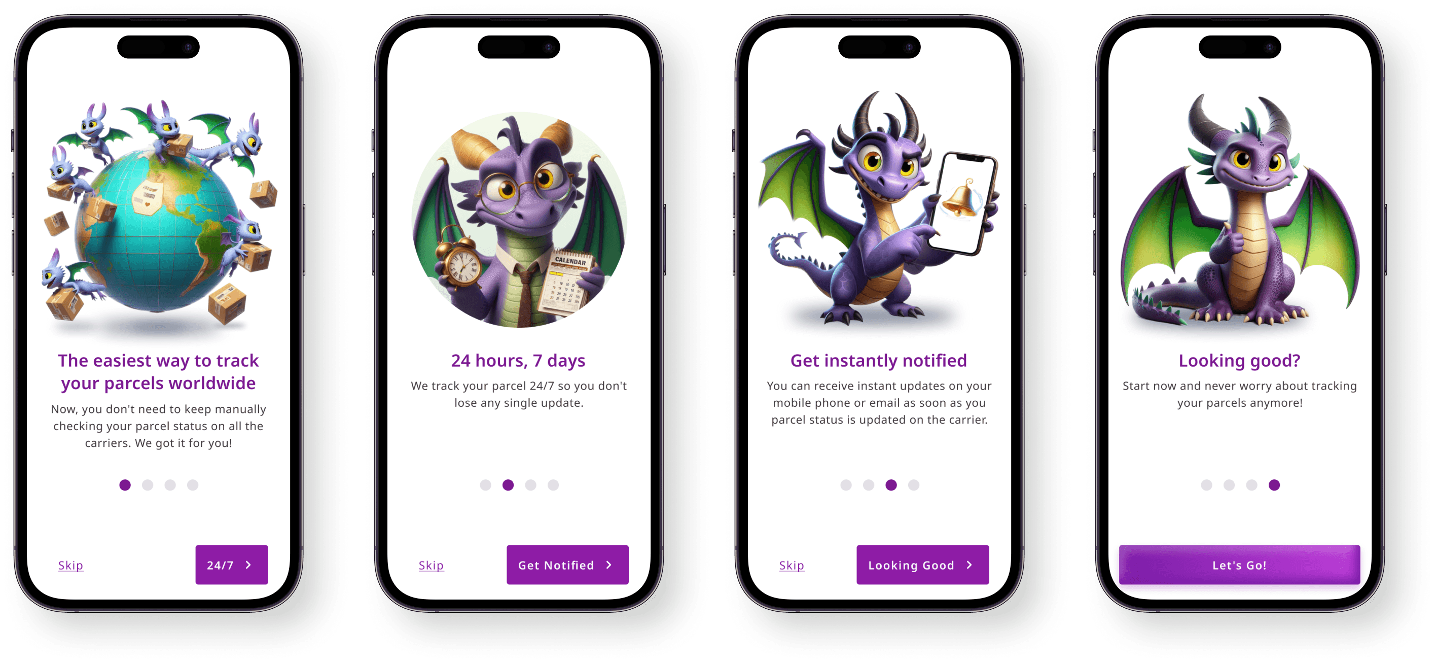
The user journey begins by establishing our unique value proposition. The onboarding screens immediately introduce our friendly dragon mascots, which serve as guides to make the experience feel less intimidating and more engaging. We explain the core benefits—centralized tracking and proactive notifications—setting the stage for a stress-free experience.

We minimized friction from the very first step. The account creation process prioritizes social logins to get the user into the app as quickly as possible. We then use a celebratory confirmation screen that reinforces our brand's personality, turning a mundane task into a moment of delight.

The core of the application is the tracking dashboard. We simplified the process of adding a package to a single input field that automatically detects the carrier, directly solving the pain of navigating multiple complex websites. The dashboard gives users an at-a-glance overview of what matters most: a custom nickname for easy identification, the estimated delivery date, and, most importantly, a simple, translated status.

This is where Trackfly truly shines. Instead of just displaying cryptic carrier statuses like "In transit to CTE," our system translates them into human, reassuring language like, "Your package is on its way to your city!" This act of translation is our key differentiator, turning user confusion into confidence.
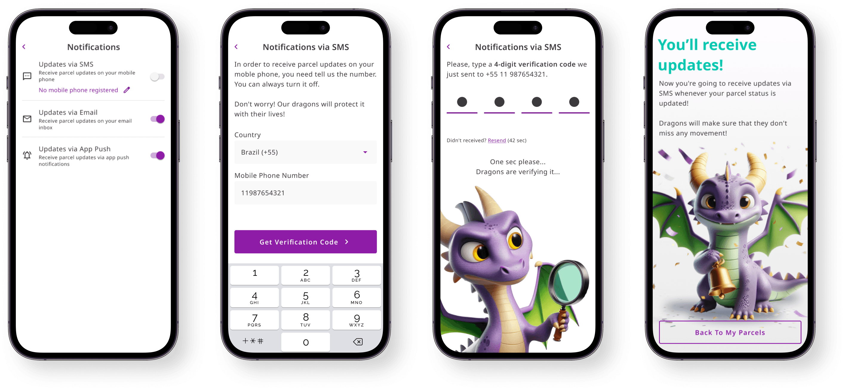
Finally, we addressed the user's need for peace of mind with proactive updates. As the #1 most requested feature in our survey, reliable push notifications were non-negotiable. This allows users to set it and forget it, trusting that Trackfly is watching over their packages and will notify them of any important changes, finally breaking the cycle of anxious, repetitive checking.

Conclusion and Key Learnings
The final design provides a comprehensive solution focused on alleviating the core emotional pain points of package tracking. The success of this MVP is being measured against the key business goals we set out to achieve: high user adoption, strong engagement, and excellent market reception, validated by our target KPIs.
This project reinforced several key learnings for me:
Performance is the Foundation of Trust
Our user interviews revealed a "cute vs. credible" tension. A playful UI is a great hook, but we learned that it must be backed by a rock-solid, reliable, and fast system. Trust is earned when the friendly dragon mascot delivers accurate information, every single time.
Translate, Don't Just Display
The most significant design opportunity wasn't in data aggregation, but in data interpretation. Shifting our mindset from "showing the status" to "explaining what the status means" was the most impactful decision we made, turning a simple utility into an invaluable service.
Focus is the MVP's Superpower
The research clearly showed that users would rather have a flawless notification system than a mediocre one with a map view. Resisting the temptation to add more features and instead focusing on perfecting the core loop—add, translate, notify—was crucial to creating a truly viable product that solved a real problem exceptionally well.
