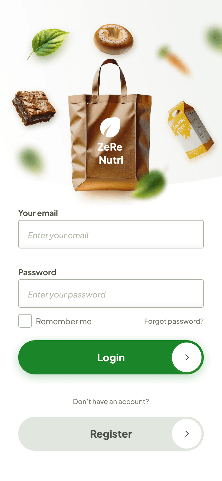
ZeRe Nutri
From frustration to feast: How ZeRe makes grocery shopping easier for dietary needs
What
Native Mobile App
Why
Portfolio project
Where
São Paulo, Brazil
Role
Product Designer
Category
E-commerce, Food & Drink
When
April 2024—May 2024
Project inspiration: Empowering dietary needs
Recognizing the challenges faced by friends with dietary restrictions, I embarked on this project to create a solution that simplifies safe food discovery. My goal is to empower individuals with dietary needs to navigate their food choices with confidence and freedom, regardless of location or circumstance.


Market Research
The claim
The market for food catering to dietary restrictions has seen explosive growth in the last decade. A report by Verified Market Research estimates the global free-from food market to reach $USD 30.9 Billion by 2028.
The problem
Dietary restrictions can be a burden. Finding suitable food, especially outside the home, takes extra effort. Social situations and the fear of missing out add to the challenge. The cost of specialty products can strain wallets too.

Competitive analysis
I conducted a competitive analysis of the top 3 apps in the industry, evaluating both user ordering workflows and negative app store reviews to identify recurring user pain points and potential areas for improvement.
iFood

Rappi

Liv Up
The good 👍
All apps allow users to search for stores nearby and buy locally.
The bad 👎
No way to schedule next-day delivery (iFood, Rappi).
No same-day or Turbo delivery option (Liv Up).
Not great variety of free-from products (Rappi, Liv Up).
No guarantee that product is safe (all).
Voice of customers


User survey
I conducted a quick survey among people who has dietary restrictions and people who has free-from food needs on WhatsApp and Facebook groups.
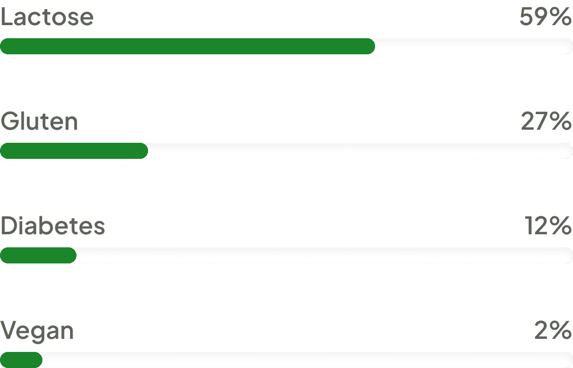
What is your dietary restriction?
38 participants
Do you know brands that specialize in free-from food?
38 participants
Notable comments


Personas
Through the development of detailed user personas, I gained a deep understanding of the needs and motivations of both customers and store owners within the app.

Sara Vicente
Social Media Manager
I love trying new foods and restaurants, but my lactose intolerance can put a damper on things. It would be amazing to find a store with delicious, lactose-free options that are convenient and won't break the bank!
Goals
Healthy & Active: Lactose intolerance makes navigating options tricky. She seeks delicious, nutritious alternatives.
Culinary Explorer: Wants a wider variety of lactose-free options to explore flavors without sacrificing taste.
Convenience is Key: Values easy meal planning and shopping. She seeks a reliable source for lactose-free staples.
Frustrations
Limited Dining Out: Feels restricted and envious of her friends' meals. Hidden dairy and few lactose-free options.
Inconsistent Products: Dislikes visiting multiple stores or relying on limited online retailers, feels like a scavenger hunt.
Social Exclusion: Surprise dairy or limited options at events make her feel left out and self-conscious about her dietary needs.
About Sara
Sarah is a young professional with a passion for health, food, and social connection. Lactose intolerance adds a layer of complexity to her life, but she doesn't let it hold her back. Sarah is constantly on the lookout for ways to maintain a healthy lifestyle, explore new culinary experiences, and participate fully in social gatherings – all while managing her dietary restriction.
Goals
Expand Accessibility: Make healthy, delicious free-from options readily available in local communities.
Build a Supportive Community: Foster a welcoming space where people with dietary restrictions feel understood and empowered.
Champion Culinary Innovation: Drive the development of exciting new free-from products that redefine what "restricted" means.
Frustrations
Limited Choices: Witnessing the struggles people face due to limited free-from options in the market.
Misconceptions: Combating the perception that free-from food lacks taste or variety.
Unreliable Sourcing: Ensuring consistent availability of high-quality free-from products for his customers.
About Davi
David's passion for food ignited in culinary school, but a close friend's experience with celiac disease opened his eyes to the challenges of navigating a restricted diet. Witnessing the limited options and frustrations firsthand, David embarked on a mission to create a better experience. "Free & Flavorful" is more than just a store; it's a community hub where people with dietary restrictions can discover delicious food, connect with others, and feel empowered to explore the world of flavor freely.
Davi Pontes
Owner & CEO of Free & Flavorful
Food is a universal language of joy and connection. Everyone deserves to experience it safely and deliciously, regardless of dietary restrictions.
Translating research into design solutions


Flow diagrams
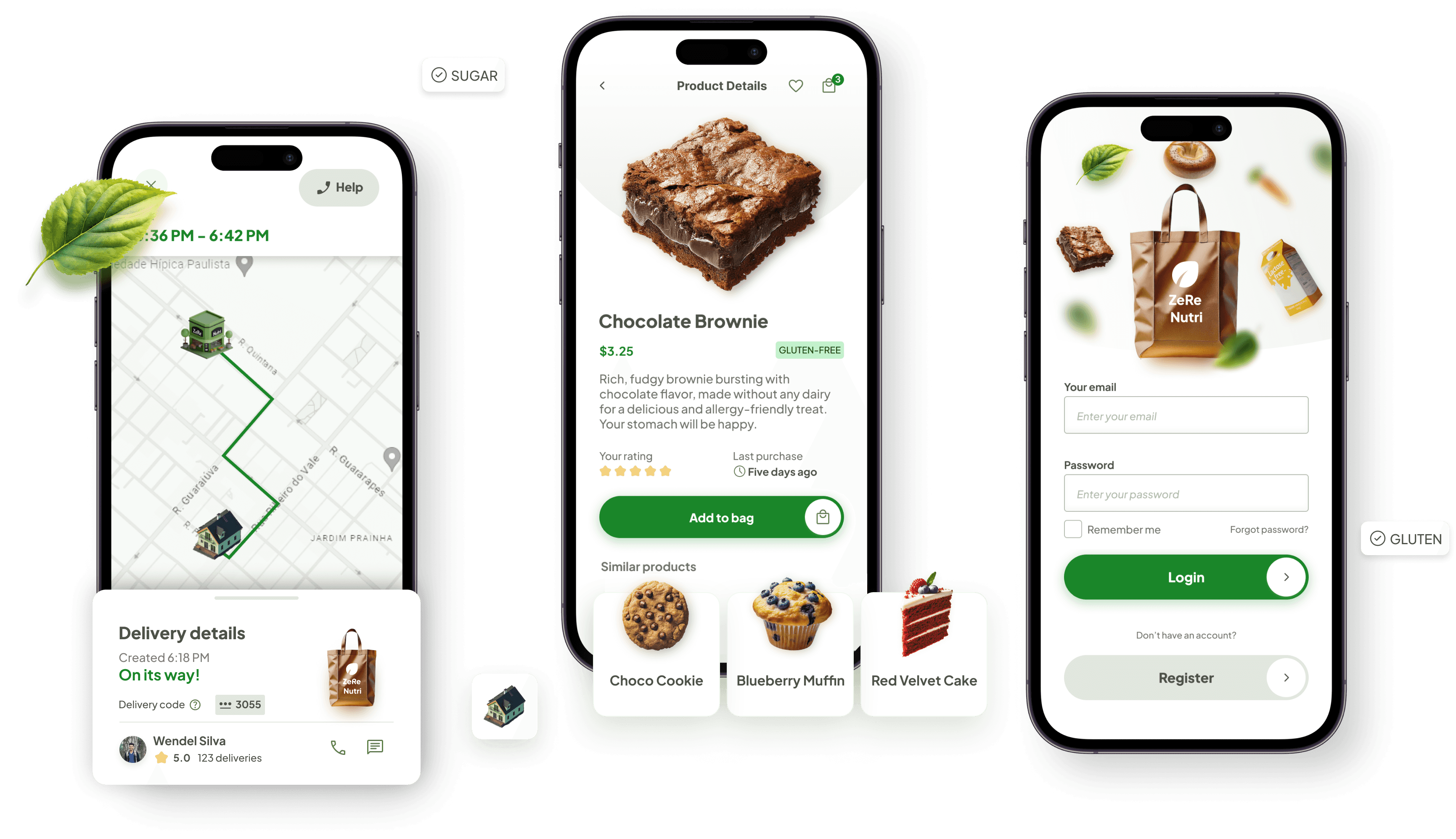
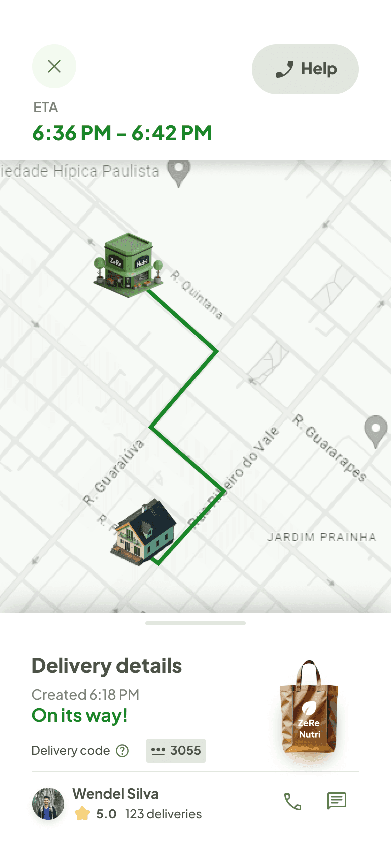
To ensure a smooth user journey, I mapped out the key tasks users can perform with a clear flowchart. Here's an example to illustrate the simplicity and efficiency of the process. While not shown here due to space limitations, I also designed flows for potential error scenarios to ensure a seamless user experience in all situations.

Low-fidelity wireframes
After mapping out the user journey with a flowchart, I designed low-fidelity wireframes for the core functionalities.

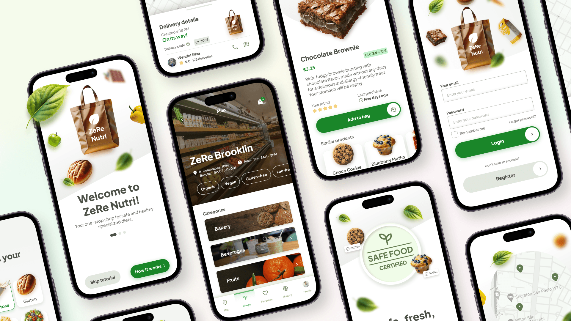
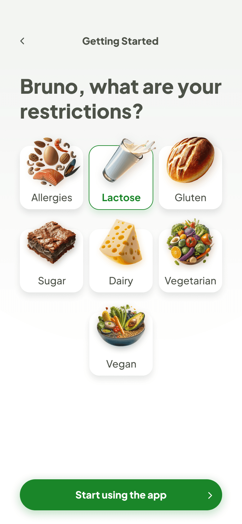
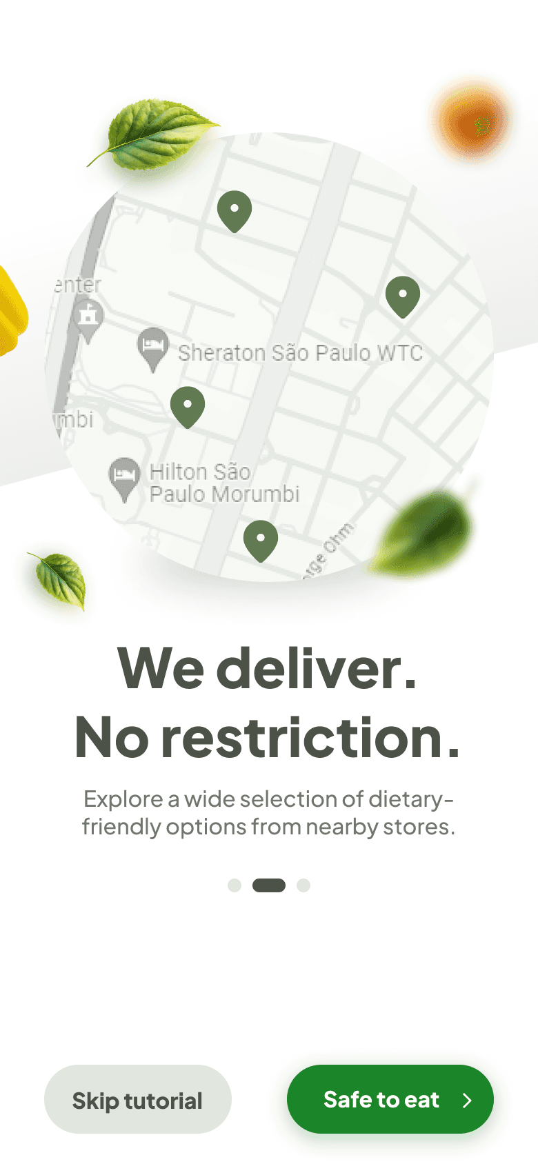
High-fidelity UI Design
Following the completion of the initial user flow, I led the creation of high-fidelity mockups for key application screens. This facilitated early user testing and stakeholder feedback, ensuring the design aligned with user needs and project goals.
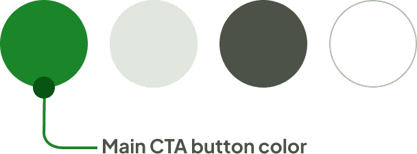
Color palette
Primary, secondary, text, background
Font
Plus Jakarta Sans: Medium, Bold, ExtraBold
AaBbCcDdEeFfGgHh
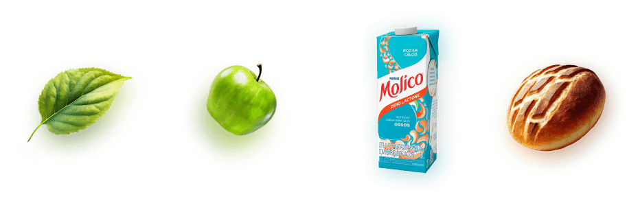
The style was achieved by using natural decorative PNG’s of leaves, fruits and safe food.


39 High-fidelity UI variations for A/B testing
I led the design of A/B testable variations: tab bar and hamburger menu navigation patterns. This facilitates data-driven design decisions in future stages.


I evaluated the effectiveness of clean white backgrounds, subtle grey gradients, and nature-inspired green tones for product screens. This iterative design process ensured the final UI prioritized user clarity and fostered a sense of trust through visual cues associated with safety and natural elements.
Optimized user experience through strategic layout
Established a robust visual hierarchy by implementing an 8-point grid system for consistent spacing and alignment. Utilized a margin strategy with varying intervals (8 & 16 within groups, 24, 32 & 48 between groups) to guide user focus and enhance information architecture. This resulted in a clear, intuitive interface that prioritizes readability and user experience.

Interactive prototype: Validating design solutions
To facilitate user testing and design iteration, I developed a high-fidelity, clickable prototype. This interactive experience allows users to navigate the app's core functionalities, providing crucial insights to validate and refine design solutions.

The prototype can be live-previewed here.
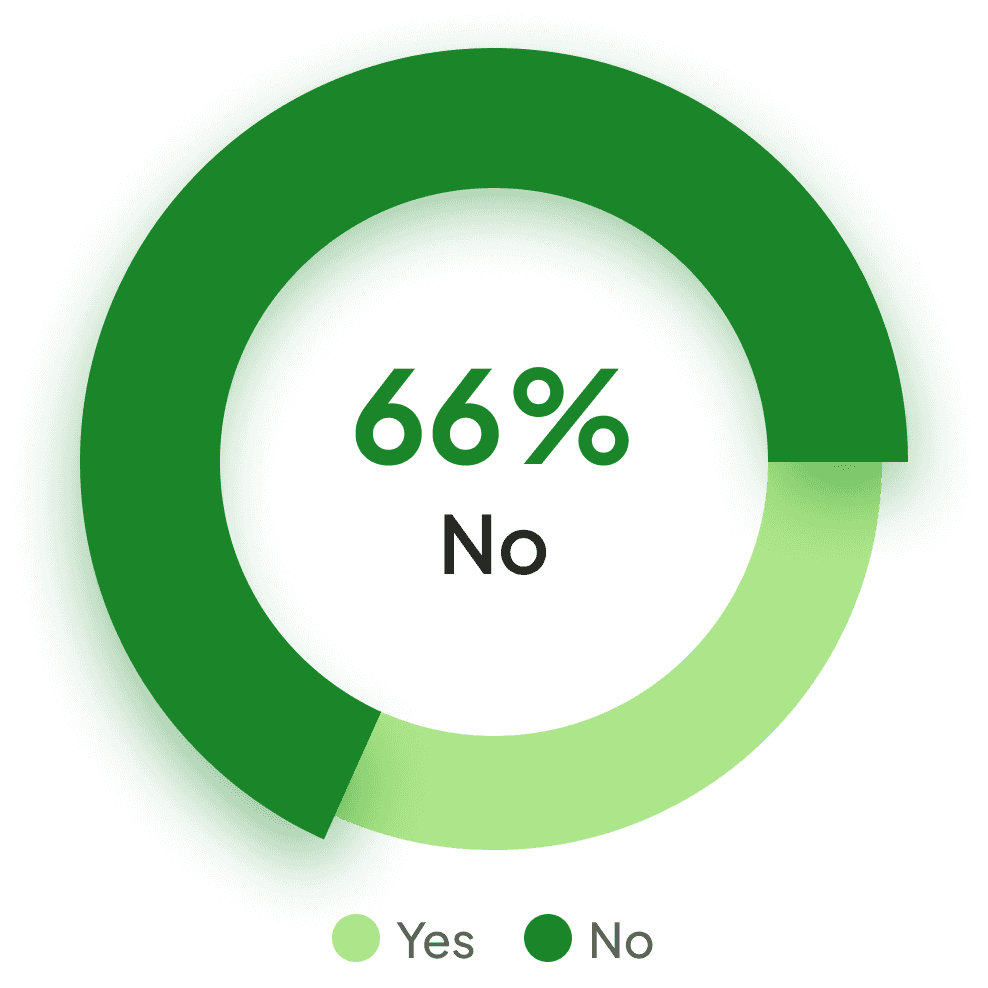
Usability Testing: Validating navigation for product discovery
To ensure users intuitively navigate the product hierarchy, I conducted usability testing with 5 participants. Each user interacted with a focused prototype showcasing category and product detail views. The objective was to assess user comprehension of the information architecture:
Can users identify the presence of additional products within categories?
Is the transition to dedicated product pages clear and effortless?
The in-person testing session involved a walkthrough of the app, followed by targeted questions to evaluate the clarity of category and product navigation elements.
Study results
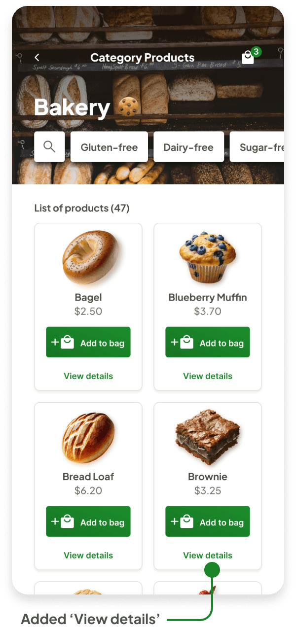
Prototype update concept
Prioritized efficiency and user convenience: To optimize the checkout process within time and budget limitations, the updated prototype prioritizes user experience by introducing a "View details" button on the product card. This complements the existing "Add to bag" functionality, allowing users to explore product information without interrupting their browsing flow and potentially accelerating their path to purchase.
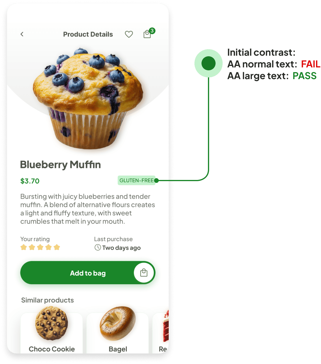
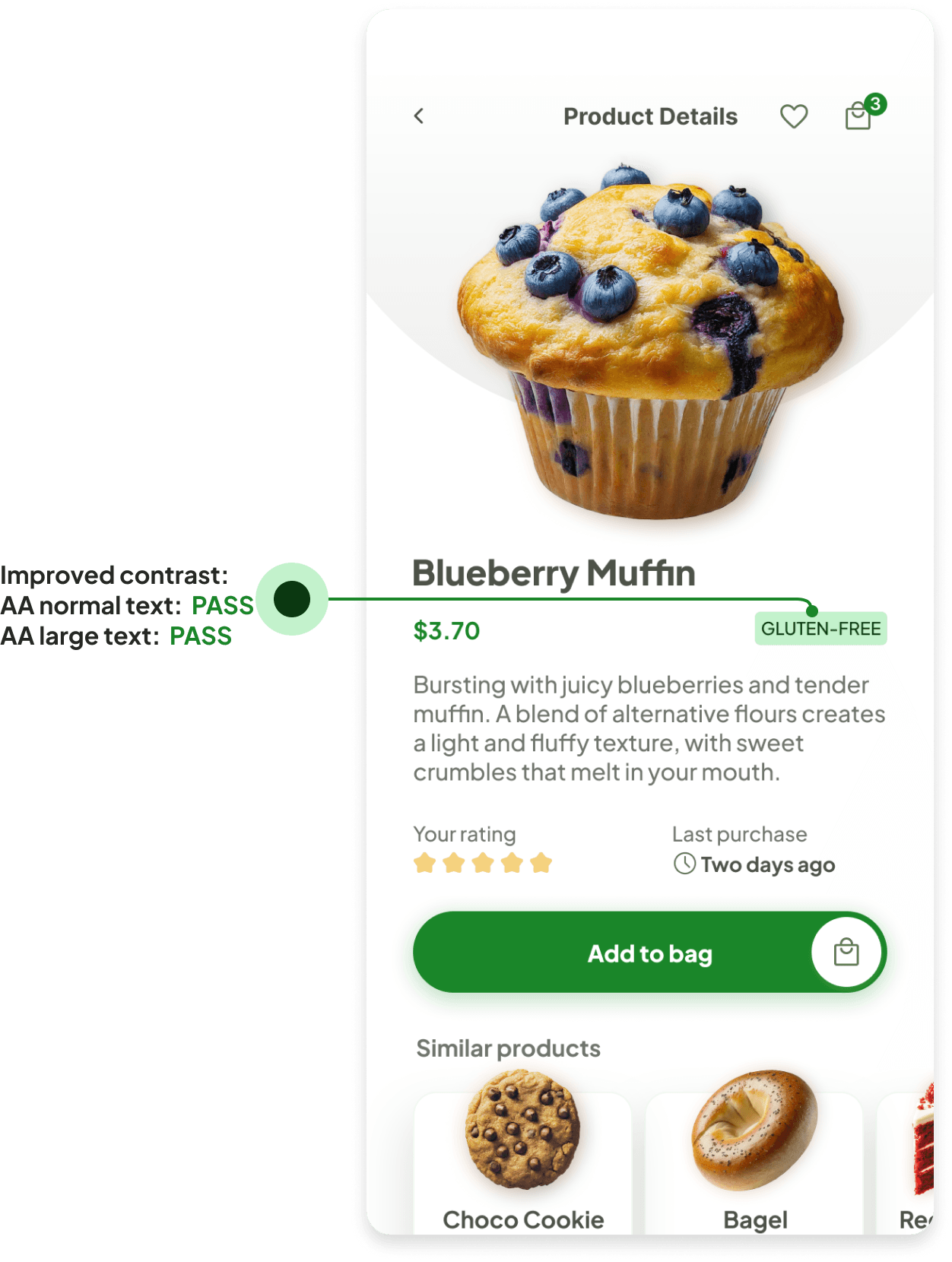
Accessibility check
I utilized WCAG AA standards to evaluate app contrast. Identified areas for improvement to enhance user experience for individuals with visual impairments.
I identified an insufficient color contrast between the "Gluten-Free" product attribute tag and its background. Recognizing the importance of inclusivity and safeness, I led the initiative to modify the type color for optimal readability, ensuring a seamless experience for all users.

Main takeaways and lessons learned
