

FinanceFlow
The design and development of a full-stack FinTech application powered by a predictive AI engine.
What
SaaS | Web Application
Why
Market + Personal need
Where
São Paulo, Brazil
Role
AI Developer & Product Designer
Category
Finance, FinTech, GenAI
When
June 2025 - Ongoing
You're currently viewing the detailed case study. Looking for the executive summary? View it here.
Overview
FinanceFlow is an AI-powered personal finance web app designed to provide users with a unified and insightful view of their complete financial landscape. This case study details the end-to-end design process, from initial research and user definition to the final solution and its market impact.
The Problem: Flying Blind in a Sea of Data
My journey with personal finance began with a simple spreadsheet my father asked me to keep in college. For nearly two decades, this manual habit was my solution, but it was also a constant source of friction. This personal "itch" was the spark for FinanceFlow, but I needed to validate if this was a widespread problem.

My initial quantitative research (N=150) confirmed this hypothesis immediately. The financial landscape for the average user is incredibly fragmented:
69% of users manage two or more financial platforms (banks, credit cards, etc.).
39% still rely on manual spreadsheets, indicating current digital solutions are failing them.
This fragmentation leads to tangible, recurring pain points that cause significant stress:
63% struggle with spending more than they planned.
59% feel a lack of vision about "where their money went."
54% admitted to forgetting to pay bills or invoices, leading to fees and anxiety.

As one user from our in-depth interviews perfectly articulated,
"I feel like I'm flying blind with my money. I know it's coming in and going out, but I don't know where or why."
The Opportunity: The Business Case for Clarity
The research data didn't just highlight a user problem; it pointed to a significant business opportunity. The high reliance on manual methods and clear user frustrations signaled a deeply underserved market.
The demand for a solution was overwhelming. When asked what the single most important feature in a finance app would be, 72% of surveyed users stated "viewing everything in one place."

Furthermore, the research illuminated the key barriers we would need to overcome to succeed:
54% cited "lack of security" as the primary reason they would not adopt a new tool.
46% would be deterred by a "confusing interface."
This gave me a clear, twofold business objective:
Build a platform that delivers the unified view users desperately want.
Do it with a simple, intuitive design and transparent security to overcome key adoption barriers.
By addressing this market gap, we could capture a large user base, drive strong acquisition, and build a product with high retention value.
The Users: Defining Our Audience
To move from data to design, I needed to deeply understand the people behind the numbers. Through qualitative interviews, I synthesized my findings into two core user personas who represented the primary mindsets I was designing for.
Financial Goals
Quickly view and consolidate all accounts
Save for major events/assets
Invest seamlessly
Eliminate debt and avoid financial slip-ups
Pain Points / Challenges
Lack of centralized vision
Forgetting bills and payments
Difficulty with spreadsheets or overly complex apps
Anxiety about surprises or unexpected expenses
Motivators/Values
Practicality, automation, clean visuals
Access to intelligent insights
I enjoy technology and integrated APIs
Digital Skill Level:
High (early adopter, curious about new things)
About Davi
Age Range: 25–35
Education: Engineering
Location: São Paulo
He lives a busy, digital-first routine, with multiple accounts (banks, cards, investments). He seeks financial independence, savings for life goals (travel, housing, career), and a start in investing.
Davi Pontes
Technology, design, or marketing professional (employee, freelancer)
“I want a single dashboard for my entire financial life, without complications.”
Hypotheses to be validated: Reaction to automation/AI, real adherence to expense and investment control, trust in consolidators.

Sara Vicente
Small business owner, freelancer or matriarch (family budget manager)
“I need a place just to see everything, without getting a headache.”
Hypotheses to be validated: Real interest in automation, most valuable types of segmentation/categorization, trust in AI, simultaneous use for people and businesses.
Financial Goals
View total assets and cash flow
Control household and business expenses
Plan and anticipate future obligations (invoices, bills, taxes)
Grow your assets safely
Pain Points / Challenges
Difficulty integrating multiple systems (spreadsheets, apps, notebooks)
Lack of time and energy to analyze financial data
Concern about recurring payments/delays
Current tools are too basic or too complex
Motivators/Values
Ease and clarity
Automation that works (no steep learning curve)
Simple visualization of future obligations and the overall picture
Digital Skill Level:
Medium (seeks practicality, but avoids excessive complexity)
About Sara
Age Range: 35–50
Education: Business Administration, MBA
Location: São Paulo
Divides attention between personal life, business, and family. Manages multiple sources of income and expenses. Needs to plan for the long term (retirement, children's education) and avoid financial hardship.
The Design Process: From Insights to Interface
With a clear understanding of the problem and our users, I focused on a design process that translated research directly into features.
A Centralized, Widget-Based Dashboard
This was my top priority. It directly addresses the primary need of 72% of users and serves both Davi's desire for a comprehensive overview and Sara's need for high-level simplicity.
Explainable AI Insights
Instead of just showing data, I designed "Spending Insights" that provide context (e.g., "Your spending on 'Dining Out' is 20% higher than your 3-month average"). This builds trust with skeptical users like Sara and satisfies the curiosity of data-driven users like Davi.
Frictionless Transaction Management
I knew manual entry was a "deal-breaker" for Davi. The solution was a robust multi-bank integration combined with smart, AI-driven categorization that users could easily override. This automation was the core engine, while the manual override provided the control needed to build trust with Sara.
Forward-Looking Net Worth Tracking
To provide motivation and a sense of progress, I created the "Net Worth Evolution" feature. It included not just a historical view but also an AI-generated forecast, helping users plan for the future—a key goal for both personas. I also allowed users to add custom sources (like "Primary Residence"), acknowledging that real-life finances are messy and not everything can be automated.
User Flow Diagram

Layout Sketches

Wireframes

The Solution: The FinanceFlow Experience
MY solution is a centralized, intuitive, and forward-looking dashboard that puts the user back in control. It is built on three core pillars:
Comprehensive Overview
Detailed Transaction Management
Clear Net Worth Tracking
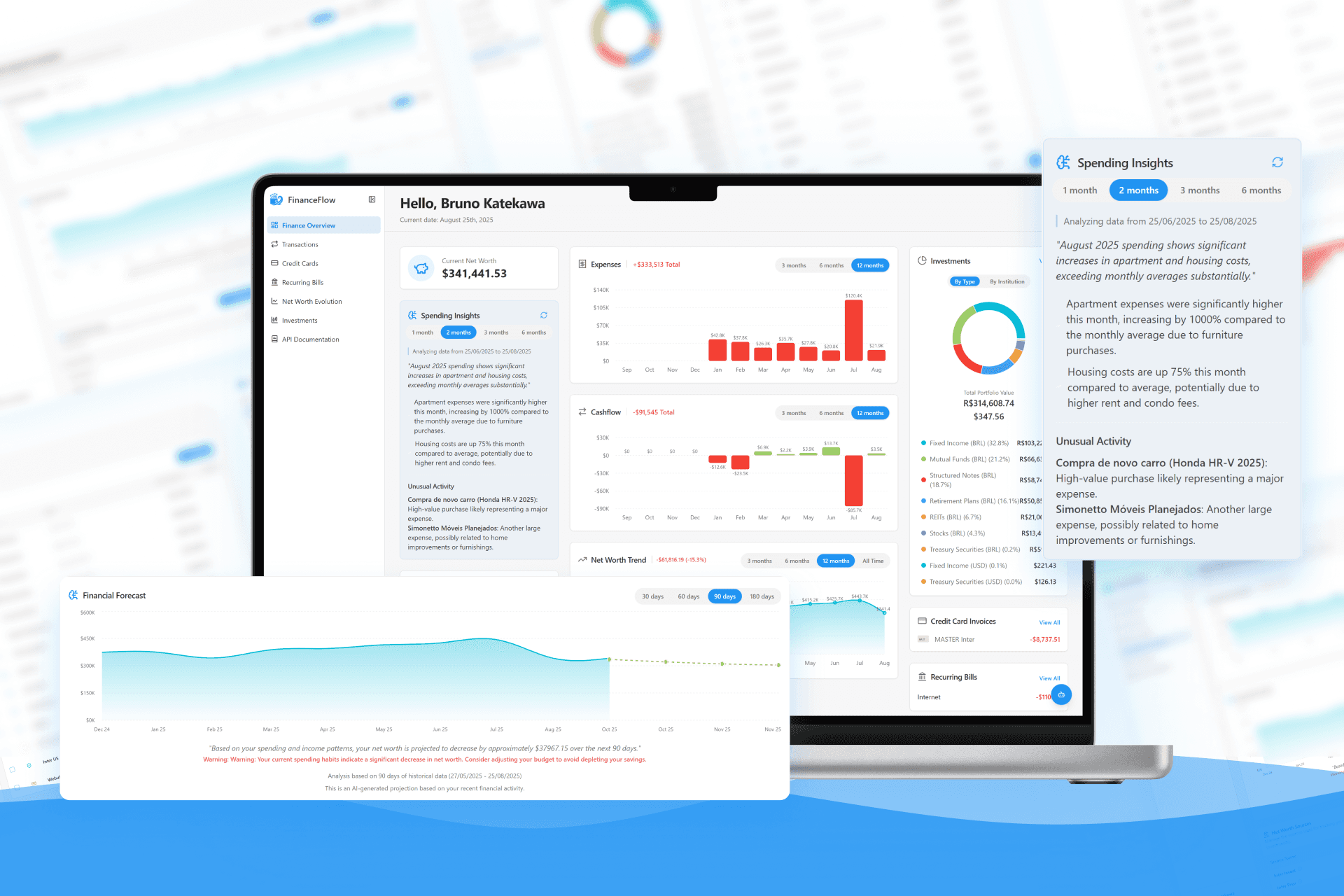
The Main Dashboard: Your Financial Command Center
The journey begins here. It provides an immediate, high-level summary of the most critical information—spending insights, cash flow, and investment performance—so users can get a quick health check without digging through multiple pages.

The Transactions Page: Answering "Where Did My Money Go?"
This screen provides a clear, searchable list of all income and expenses. A visual breakdown of expenses by category helps users instantly identify where they can cut back, directly addressing the pain point felt by 59% of our surveyed users.

The Net Worth Evolution Page: Tracking Long-Term Goals
This was more than just a number; it was about showing progress. The main chart visualizes net worth growth over time, providing a sense of accomplishment. The AI-generated forecast helps users plan for the future, and the ability to manage all asset sources in one place—from bank accounts to crypto wallets—delivers the unified view they craved.

Building a System of Trust and Clarity
To ensure consistency and scalability, I developed a design system built on a foundation of clarity, accessibility, and trust. Every component, from the color palette to the iconography, was chosen to support these core principles.
Inputs

Selection Controls

Buttons

Two cornerstones of this system were our intentional choices for typography and color, which work together to create an environment where users feel confident and in control.
Typography: The Voice of Clarity
I chose Inter as the primary typeface because its design philosophy aligns perfectly with the needs of a financial application.
Optimized for Financial Data: Inter was specifically designed for high legibility on screens, which is critical when users must read numbers and small text with absolute clarity. This attention to detail extended to the technical implementation, where we enabled specific font features to improve the distinction between characters like 'I' and 'l', and numbers like '6' and '9'.
Projecting Professionalism and Hierarchy: The font provides a clean, modern look that builds a sense of trust. I strategically used its comprehensive weight range to establish a clear visual hierarchy: body text is set in Regular (400), headings in Semibold (600), and key financial values in Bold, guiding the user's eye to the most important information on the screen.

Color: The Foundation of Trust and Focus
The color system was meticulously crafted to support the application's goals and enhance the user experience.
--primary
#1A8CFF
Application primary color (VS Code blue)
--background
#F9FAFD
Main application background color
A Professional and Trustworthy Palette: The core of the palette is a professional and trustworthy blue (-primary), inspired by familiar developer tools to evoke a sense of reliability. This is complemented by a calm, very light blue-gray (-background), creating a sense of space and reducing eye strain.
--secondary
#EDEDED
Secondary elements
--muted-foreground
#737373
Text on secondary elements
Clarity Through Contrast and Hierarchy: I established a clear visual hierarchy through contrast. I used a range of grays for secondary (-secondary-foreground) and muted (-muted-foreground) text to guide the user's eye, ensuring that primary information stands out while supplementary details remain accessible but unobtrusive.
--success-background-hsl
#E6F7E6
Background for success messages
--destructive
#FF3B30
Color for dangerous actions
Accessibility and Unambiguous Feedback: The entire color system was designed with both Light and Dark Modes from the outset, ensuring a comfortable viewing experience for all users. Furthermore, I defined distinct, high-contrast colors for user feedback—a clear green for success (-success-background-hsl) and a vibrant red for destructive actions (-destructive)—ensuring that system status is communicated unambiguously.
Data Visualization with Purpose: The chart colors were chosen not just for aesthetics, but for maximum differentiation. Each of the five chart colors has a distinct hue (teal, green, red, blue, orange) to ensure that data segments in graphs are easy to distinguish at a glance, allowing for quick and accurate financial analysis.
--chart-1
#00D6D6
Teal
--chart-2
#99CC66
Green
--chart-3
#FF4D4D
Red
--chart-4
#3399FF
Light blue
--chart-5
#FF9933
Orange
Together, these systems for typography and color create a cohesive, intuitive, and trustworthy experience, ensuring users feel confident and in control of their finances
Measuring Success & Future Vision
As FinanceFlow is a conceptual project born from a personal need, the final design has not yet been launched for general availability to gather long-term quantitative data. However, the design was intentionally structured to drive specific, measurable outcomes that would define its success.
Defining Key Performance Indicators (KPIs)
If launched, I would track the following metrics to validate our design decisions and measure the product's impact:
User Engagement & Habit Formation
The primary goal is to make financial management a regular, low-effort habit. I would track Weekly Active Users (WAU) and aim for a high WAU-to-MAU (Monthly Active Users) ratio. A high ratio would indicate that users are consistently returning and finding value.
Feature Adoption Rate
To confirm our solution addresses the core problem, I would monitor the adoption of key features. Success would be seeing:
Over 70% of new users connect at least one bank account within their first week.
A 50% adoption rate for the "Net Worth Evolution" feature within the first month
Task Success Rate
A critical measure of usability would be the success rate for core tasks. I would aim for a Task Success Rate of over 95% for "categorizing a transaction," ensuring the flow is frictionless for both our "Davi" and "Sara" personas.
User Retention
Ultimately, the platform's value is measured by its ability to keep users. I would track Month-over-Month (MoM) retention, aiming to outperform the industry benchmark for fintech apps within the first six months.
Qualitative Validation
Initial feedback from my user interviews concept testing was overwhelmingly positive. Users called the unified dashboard "the financial clarity I've been searching for for years." This strong qualitative validation gives me confidence that the design would positively impact the quantitative KPIs listed above.
Future Vision & Next Steps
The journey doesn't end at the development phase. The logical next steps are focused on ensuring a successful launch and a data-driven future for the product:
Conduct Pre-Launch Usability Testing
Before a general release, I would run moderated usability tests with a small group of target users on the live production application. This would allow me to gather crucial baseline data on the Task Success Rate for core flows and identify any final friction points.
Initiate a Phased Public Launch
I would begin with an invite-only release to a small segment of our target audience. This controlled rollout would allow me to start tracking the defined KPIs in a real-world environment and ensure the platform is stable and performing as expected.
Iterate Based on Data
The quantitative and qualitative insights gathered from the initial user cohort would directly inform the next iteration of the product roadmap, ensuring I continue to build a tool that is not only beautiful but truly impactful
Key Learnings & Reflections
This project reinforced several key principles of product design:
Clarity Over Complexity
In finance, it's easy to overwhelm users with data. My biggest challenge was balancing information density with a clean, intuitive interface. We learned that users valued a clear, high-level summary on the dashboard far more than seeing every single detail at once.
The Power of Proactive Insights
Simply displaying data isn't enough. Features like the AI-powered "Spending Insights" and the "Financial Forecast" were game-changers. Users don't just want to see their history; they want guidance on what might happen next and what they should pay attention to.
Design for Real-Life Scenarios
People's financial lives are messy. Allowing users to add custom sources like "Primary Residence" or manually adjust values was crucial. Acknowledging that not everything can be automated made the tool more flexible and trustworthy for users like Maria, who have complex financial situations.
Translate AI output into a user-centric experience
My primary lesson was that real value comes not from just detecting an anomaly, but from presenting that insight with context and clarity. Translating raw AI output into something meaningful requires designing with deep user empathy.
A successful AI feature is built on a strong data foundation
A key technical challenge was structuring data and prompts to ensure the AI's analysis was consistently accurate and relevant. This proved that a great AI user experience depends as much on thoughtful data engineering as it does on the interface design itself.
Embrace a holistic, end-to-end approach
Managing this project from the initial concept to the final AI integration reinforced how every decision, technical or strategic, directly impacts the user experience. This holistic view was essential for creating a cohesive and truly useful product.